
WindBorne Guardian: Extreme Weather Preparedness for Utilities
- timeline
- Spring 2026
- role
- Product DesignerFrontend EngineerProduct Manager
- skills
- Product DesignFrontend Engineering0 -> 1User Research
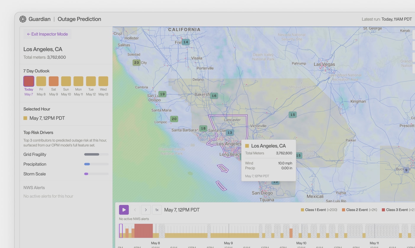
Guardian turns weather forecasts into operational decisions for power utilities. It predicts outages up to 14 days out, flags the infrastructure most at risk, and shows crews where to stage before the storm arrives.
Context
WindBorne flies the largest fleet of long-duration weather balloons in the world. All of that data feeds a global model that is very good at seeing a storm coming days before everyone else does.
A better forecast is only half the story. The people running a power grid do not think in weather terms. They think about their own system: which parts of their territory get hit, how many customers lose power, how many crews they need and where to send them.
So the real work was turning a good forecast into disaster preparedness. Extra warning only helps if it buys a utility more time to get ready, and a clear picture of what to get ready for.
Problem
Every utility we talked to was already full of dashboards: one for weather, one for equipment condition, one for crew schedules, one for the map of their network. None of them answered the question that actually mattered, so the answer got worked out on phone calls and in spreadsheets.
Five days before a big storm, a planning chief would hold a weather map next to a map of their own power lines and make a best guess about where to send trucks early. Guess wrong and the crews end up in the wrong place, and customers wait longer to get their power back.
- The forecast showed where wind and rain were likely. Someone still had to work out what that meant for their equipment and their crews.
- Weather, equipment condition, and past outages lived in different tools, and nobody had time to line them up while a storm was coming.
- Hospitals, water plants, and other critical sites were the easiest to lose track of and the most important to protect.
Design principles
Progressive disclosure: At a glance v.s. dive deeper
While there is a large amount of relevant information to disclose to the users, information should have different weights in the interface, and we shall not dump all the insights to the user at once. The goal is to incorporate both high-level situational summary and deep-dive analysis without overwhelming them upfront.
We should establish the hierarchy between what the users should understand immediately when they open up the interface, and what they can click a few more buttons and investigate later.
The interface should enable instant clarity: “What is the risk? How severe? Where should I pay attention?” Other detailed explanations can go “under the hood”, allowing users to understand what inputs go into consideration, the reasoning behind how an insight is constructed, etc.
Translate weather signals into operational language
Weather information is more useful when it is translated into the operational questions users need to answer.
The Emergency Planning Chief does not need to necessarily know that a severe storm is coming. They need to understand what a storm means to their system: How many customers may experience outages? How many lines or poles may be down? How many crews are needed?
By turning weather signals into operational impact, we help users understand storm impact, plan resources, and plan actions with more confidence.
Establish trust through UI
The interface is the most direct way users experience with the underlying WindBorne intelligence. To build trust, we need to be transparent, reliable, and honest about the information presented.
- “Data last updated at: Today 5PM” — reduces confusion about whether they are looking at latest information.
- Loading state when data is still loading — prevents mistaking an unfinished state for an empty/broken state.
- “Data not available” when data failed to load — clearly communicates system limitations.
- “Model estimates. Check real conditions” — sets the right expectation for model outputs.
Avoid jumping off the credibility cliff
Weather forecasts are inherently uncertain. No forecast can be 100% accurate or delivered with 100% confidence. Consequently, it is “impossible” to give the user a definite answer.
Because of this, we need to be thoughtful about how we present the predictions and recommendations to the users. We need to set the correct expectations, clearly communicating what we can reliably support today without underselling or overpromising what the system can prove.
Build explainable AI
When designing AI-powered products for Disaster Preparedness, especially for industries / user groups like utilities, who are risk-averse and conservative, we have to be careful of how we incorporate AI into their workflow and how we can make it a “glassbox” AI experience.
In order to build explainable AI, make sure we can explain:
- What data goes into the model.
- What is the output.
- How is the output generated / reasoning behind the output.
- What expectation users should have.
- Traceability so AI is accountable.